![]()
In the News
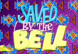
I find it amazing that a branding campaign introduced four years ago is still making headline news. It is not good news, it is not even a good logo *cough. BUT this just proves how much impact a design can have on the world. The London 2012 Olympic logo, which looks like something out of a Saved by the Bell episode, is making controversial news this week. The country of Iran has threatened to boycott the 2012 summer Olympic games because they are offended by the logo (you’re not alone). Iran claims the logo does not read “2012” but instead reads “ZION” which Iran says represents a veiled pro-Israeli conspiracy.” (full article found at guardian.co.uk article.)
How did we get to this point? Did Iran just now realize–four years later–that this resembles a symbol in which they dislike? Why wait four years to voice your opinion?
The Design
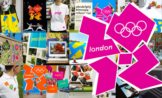
 I wonder how the branding specialists at Wolff Olins came to the conclusion of a logo that looks like something Zack Morris and the gang whipped up for a school dance. I found a breakdown of the logo by the design firm that had strategically filled the spaces of the logo with different outlines of fields that would seen at the Olympic games (i.e. tennis court, basketball court, swimming pool, etc.) To say the least it was a stretch. I interpreted it as if the designers intended people to realize on their own that the shapes created by the numbers “2012” were representations of these different fields. Interesting concept, but poorly executed.
Take a look at some of the ways they are applying the logo below. (branding images found at WolffOlins.com, and one of my favorite blogs, Logo Design Love