Team
Nick Conflitti, Nate Amack (engineer)
Role
Design lead, UX Writer, User research
Tools
Sketch, Abstract, Invision, Storybook
Overview
The Automate Design System (ADS) was built for Project Automate and its three apps, the internal admin web app, customer-facing web app, and customer mobile app, to utilize. ADS consists of global/foundational styles, components, patterns, and guidelines used for creating a unified UI across the platform. These assets took the form of a Sketch design kit, a documentation and usage guideline repository, and a component library. As the lone designer on an engineering team with three workstreams, and three other engineering teams on standby to start contributing, I knew it was crucial to start establishing guidelines and consistency from the beginning.
The benefit to being the lead designer for the design system and the product designer presented a great opportunity to learn best practices for organization, accessibility of assets, and documentation depth.

Establishing team agreements
The ADS came together in an unconventional manner. Since Project Automate was a greenfield initiative with the pressure of getting to market as quickly as possible, we built the design system as we were developing features for the platform. We found that it was important to establish some team agreements to ensure quality and clear communication. Adopting an “inspect and adapt” mindset for trying different approaches was key. We tried different ways of handing off designs, writing stories, alternating the frequency of meetings, among other things. These practices helped ensure quality and accuracy of the components, and established efficiencies across:
- Weekly design reviews
- UX acceptance testing during QA
- Story writing collaboration
- Weekly change log updates from the designer
2
Team Size
35
Pages of Documentation
241
# of Icons
325
Symbols / Variables
Wearing two hats
Working as a designer on Project Automate meant having designs ready for three distinct workstreams on top of creating and maintaining the design system.
- Asking ‘What’s the next section/feature on deck?’
- Design and usability testing
- Identify new (or adjust existing) global styles and components
- Add all new components to the design kit’s library files and develop engineering documentation
- Create user stories for engineers to code the components
- Kickoff the development process of actually creating the component and its variations
- QA the coded component and add basic guidelines to Storybook
- Rinse and repeat

Specifying the color palette and defining design token naming conventions.

Defining type style and the accessible colors and uses along with design token naming conventions.
Q & A
Q: What considerations were put into developing the ADS for both web and mobile?
A: A great deal. Although the user personas were different (for the most part) we still wanted cohesion between the native mobile app and web app. From a library standpoint, we utilized the same color palette and UX patterns where possible. However, we also wanted the native apps–-even though we were developing with React Native–-to feel like a native app to the user.
From a design kit perspective, I created crucial symbols for mockup purposes for iOS and Android. This resulted in two separate libraries for web and mobile components with each sharing the same foundations library for the native operating system’s fonts specified. On the development front, the heavy lifting was primarily handled by the libraries we chose to utilize with React Native. Because of this, we were able to get away with minimal engineering customization to achieve a native feel.
Q: What considerations were put in to developing the ADS for both web and mobile?
A: A great deal. Although the user personas were different (for the most part) we still wanted cohesion between the native mobile apps, and the web app. From a library standpoint, we utilized the same color palette and UX patterns where possible. However, we also wanted the native apps–even though we were developing with React Native–to feel like a native app to the user’s operating system.
From a design kit perspective, I created crucial symbols for mockup purposes for iOS and Android. This resulted in two separate libraries for web and mobile components and patterns, but with each sharing the same foundations library with the native operating system fonts specified for each. On the development front, the heavy lifting was primarily handled by the libraries we chose to utilize with React Native. We were able to get away with minimal engineering customization to achieve a native feel.

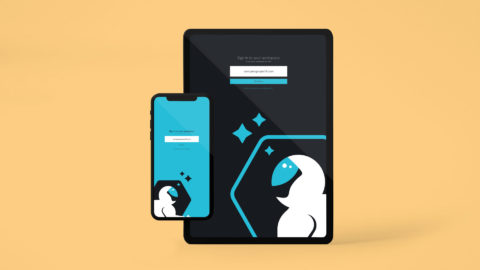
Defining light and dark mode specification for small and large screen sizes.
Q: Was there a requirement for the web app to be responsive or adaptive?
A: There was no requirement for the web app to be responsive as we defined our MVP. Our research had shown that the vast majority of our audience made up of people like Oliver, Betsy, and Abby preferred doing their work on a desktop or laptop. Mostly because their job consisted of tasks like editing data tables, or building workflows, which require large screens for ease of use. But all of the design kit assets, and coded components were built with responsiveness in mind for the vast range of screen sizes we were targeting.

Q: Was there any sort of guiding light or inspiration for the ADS?
A: Yes, we referenced a few well established benchmarks. When developing an MVP for any new platform, getting user feedback is the most important thing to make sure you’re headed in the right direction. Therefor we tried to take bits and pieces from companies who have already put in the work and research to find the best patterns. We often referred to Apple’s HIG, IBM’s Carbon, and Google’s Material Design library for guidance on standards and interactions.
We also opted to utilize a 3rd party, open source library for our component library after lots of internal research and debate. We went this route to cut out the maintenance overhead of a library, and leverage the community contributing to this library. This allowed us to spin up user interfaces very fast as we customized the components to our own liking and branding.


Outcomes
Unfortunately, the Automate Design System–like Project Automate–was shelved when the acquisition of GoSpotCheck was completed.
This experience changed and elevated my perspective on systems thinking. Thinking holistically, designing holistically, and building holistically adds value to more than just the user. As a designer, an engineer, and a PM, the team found value in thinking in this fashion and it ensured consistency across the platform. Specifically from a designer perspective, it leveled up my thinking and planning as a product designer and it also drastically increased the speed in which I was able to generate prototypes. This increased efficiency in designing enabled me to do more user testing, make changes on the fly, and communicate designs and interactions very clearly.