This past weekend was the long-awaited opening weekend of college football. Finally some football? No more bad press about the OSU Buckeyes and the “well-polished” Jim Tressel, or the increasing number of college players who are suspended for taking “gifts” in Miami. Well, besides the unusual outcomes due to weather conditions in Ann Arbor and South Bend, and the dreadful display of performances between the no. 3 and no. 4 ranked teams in college (LSU and Oregon), it was still a pretty boring week in college football. Mediocre at best.
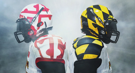
But the game that made a splash on the sporting world came Monday night and lasted well in to Tuesday, was the University of Maryland v.s. University of Miami game. Not for the outcome, but because of the wildly nontraditional uniforms that the Maryland Terps were wearing.
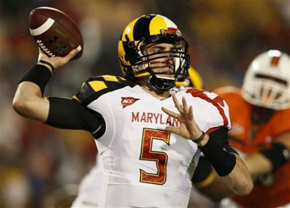

This year the Maryland Terps will be sporting 16 different jersey (red, white, black, and gold) and helmet combinations. This is not including the number of possibilities that cleats add to the wardrobe. The jerseys were designed by the popular athletic apparel company, Under Armour. This was undeniably sparked by Nike’s involvement with the redesign of the Oregon Ducks 2010 uniforms that made quite the splash last year (no pun intended). The design choices were based around the Maryland State flag’s colors and patterns (gag). Sorry Marylanders.
So I raise two questions. Are the redesigns of college football jerseys a good or bad thing? Some think that it takes away a form of tradition that schools have built up throughout the years. Agree. Some people are angry and see the sole purpose of the redesigns being another ploy for the marketing world to have companies shove their brand in your face. Definitely agree.
Do we even like the jerseys? In the case of the Oregon ducks, there is probably a solution that will eventually be thought of to improve Nike’s wild combat design for the Ducks’ jerseys. Until then, go ask Gordon Bombay for some tips Nike. As for the Maryland Terps’ jerseys, I am undecided whether or not I like them. I think they are clever and even successful on some levels by incorporating the flag’s patterns in a mirrored fashion, but they could use some tweaks. Why are there so many combinations? Great idea, but come on Under Armour/Maryland! Make up your minds and have a home and away jersey like everyone else. Maybe a throwback of some sort to spice things up once a year. Our brains as a society are already flooded with too many choices and messages from the media. Make it easy for us. A great, single icon, doesn’t need a supporting cast of color schemes and patterns to make a brand successful or memorable.
Nevertheless, if this is going to keep happening, the good ole maize and blue wings of the University of Michigan better be left untouched.