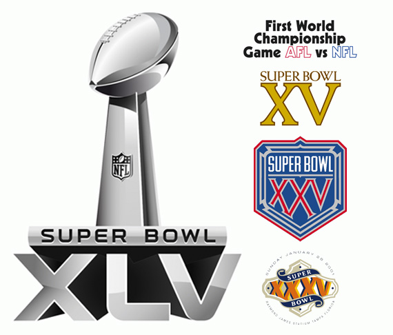
The Superbowl is the biggest event in American sports. The 4 hour long event, has been turned in to a 7+ day media frenzy with all the major companies looking to appeal to the largest market of the year. As a designer I love seeing the event’s branding evolve from year-to-year. Shown here are a handful of Superbowl identities including this year’s–Superbowl 45. If you continue to the link that is cited, it is very interesting to see the variety of typeface selections. Ranging from decorative, to slab serif, to sans serif–each year’s identity is specific to the site where the Superbowl is hosted. Some choices wise, others… Not so much. See for yourself, and feel free to comment.
Images found at Chris Creamer’s website