Propeller Design System (2020)
Team
Nick Conflitti, Nate Amack (engineer)
Role
Design lead, UX Writer, User research
Tools
Sketch, Abstract, Invision, Storybook
Overview
The Automate Design System (ADS) was built for Project Automate and its three apps, the internal admin web app, customer-facing web app, and customer mobile app, to utilize. ADS consists of global/foundational styles, components, patterns, and guidelines used for creating a unified UI across the platform. These assets took the form of a Sketch design kit, a documentation and usage guideline repository, and a component library. As the lone designer on an engineering team with three workstreams, and three other engineering teams on standby to start contributing, I knew it was crucial to start establishing guidelines and consistency from the beginning.
The benefit to being the lead designer for the design system and the product designer presented a great opportunity to learn best practices for organization, accessibility of assets, and documentation depth.

Establishing team agreements
The ADS came together in an unconventional manner. Since Project Automate was a greenfield initiative with the pressure of getting to market as quickly as possible, we built the design system as we were developing features for the platform. We found that it was important to establish some team agreements to ensure quality and clear communication. Adopting an “inspect and adapt” mindset for trying different approaches was key. We tried different ways of handing off designs, writing stories, alternating the frequency of meetings, among other things. These practices helped ensure quality and accuracy of the components, and established efficiencies across:
- Weekly design reviews
- UX acceptance testing during QA
- Story writing collaboration
- Weekly change log updates from the designer
2
Team Size
35
Pages of Documentation
241
# of Icons
325
Symbols / Variables
Wearing two hats
Working as a designer on Project Automate meant having designs ready for three distinct workstreams on top of creating and maintaining the design system.
- Asking ‘What’s the next section/feature on deck?’
- Design and usability testing
- Identify new (or adjust existing) global styles and components
- Add all new components to the design kit’s library files and develop engineering documentation
- Create user stories for engineers to code the components
- Kickoff the development process of actually creating the component and its variations
- QA the coded component and add basic guidelines to Storybook
- Rinse and repeat

Specifying the color palette and defining design token naming conventions.

Defining type style and the accessible colors and uses along with design token naming conventions.
Q & A
Q: What considerations were put into developing the ADS for both web and mobile?
A: A great deal. Although the user personas were different (for the most part) we still wanted cohesion between the native mobile app and web app. From a library standpoint, we utilized the same color palette and UX patterns where possible. However, we also wanted the native apps–-even though we were developing with React Native–-to feel like a native app to the user.
From a design kit perspective, I created crucial symbols for mockup purposes for iOS and Android. This resulted in two separate libraries for web and mobile components with each sharing the same foundations library for the native operating system’s fonts specified. On the development front, the heavy lifting was primarily handled by the libraries we chose to utilize with React Native. Because of this, we were able to get away with minimal engineering customization to achieve a native feel.
Q: What considerations were put in to developing the ADS for both web and mobile?
A: A great deal. Although the user personas were different (for the most part) we still wanted cohesion between the native mobile apps, and the web app. From a library standpoint, we utilized the same color palette and UX patterns where possible. However, we also wanted the native apps–even though we were developing with React Native–to feel like a native app to the user’s operating system.
From a design kit perspective, I created crucial symbols for mockup purposes for iOS and Android. This resulted in two separate libraries for web and mobile components and patterns, but with each sharing the same foundations library with the native operating system fonts specified for each. On the development front, the heavy lifting was primarily handled by the libraries we chose to utilize with React Native. We were able to get away with minimal engineering customization to achieve a native feel.

Defining light and dark mode specification for small and large screen sizes.
Q: Was there a requirement for the web app to be responsive or adaptive?
A: There was no requirement for the web app to be responsive as we defined our MVP. Our research had shown that the vast majority of our audience made up of people like Oliver, Betsy, and Abby preferred doing their work on a desktop or laptop. Mostly because their job consisted of tasks like editing data tables, or building workflows, which require large screens for ease of use. But all of the design kit assets, and coded components were built with responsiveness in mind for the vast range of screen sizes we were targeting.

Q: Was there any sort of guiding light or inspiration for the ADS?
A: Yes, we referenced a few well established benchmarks. When developing an MVP for any new platform, getting user feedback is the most important thing to make sure you’re headed in the right direction. Therefor we tried to take bits and pieces from companies who have already put in the work and research to find the best patterns. We often referred to Apple’s HIG, IBM’s Carbon, and Google’s Material Design library for guidance on standards and interactions.
We also opted to utilize a 3rd party, open source library for our component library after lots of internal research and debate. We went this route to cut out the maintenance overhead of a library, and leverage the community contributing to this library. This allowed us to spin up user interfaces very fast as we customized the components to our own liking and branding.


Outcomes
Unfortunately, the Automate Design System–like Project Automate–was shelved when the acquisition of GoSpotCheck was completed.
This experience changed and elevated my perspective on systems thinking. Thinking holistically, designing holistically, and building holistically adds value to more than just the user. As a designer, an engineer, and a PM, the team found value in thinking in this fashion and it ensured consistency across the platform. Specifically from a designer perspective, it leveled up my thinking and planning as a product designer and it also drastically increased the speed in which I was able to generate prototypes. This increased efficiency in designing enabled me to do more user testing, make changes on the fly, and communicate designs and interactions very clearly.
Propeller R&D (2020)
Team
Nick Conflitti (designer/PO), Eric Gould (eng), Nate Amack (eng), Alexander Peletz (eng), Aaron Schaef (eng), Sean Dougherty (eng), Billy Arlew (QA), Kory Cunningham (PM)
Primary role
Design lead, UX Writer, User research
Responsibilities
- UX/UI design
- Design library asset creation management
- Component library documentation
- Qualitative user testing and analysis
- Quantitative user testing and analysis
- User story writing
- Ceremony conductor
- Roadmap planning
- Hard question asker
Background
GoSpotCheck’s (now FORM MarketX) platform is positioned to help any business who traditionally collects information through spreadsheets and pen and paper. More notably, the product was targeted at users who primarily use mobile devices to complete their work out in the field. Field workers utilize GoSpotCheck’s mobile app to complete surveys, audits, and simple project tracking in the form of what we call, workflows. The managers of said field workers utilize GoSpotCheck’s web app to build the workflows and distribute them to their mobile workforce.
In doing this, field workers (known as “Doers”) complete simple forms that are built by their managers (known as “Builders”). These forms are often comprised of simple form elements like multiple choice questions, write-ins, Yes/No, and photo capture tasks but are not data-driven.
Project Propeller set out to make workflows data-driven. Some of the biggest complaints we heard from clients and prospects were that the workflows should be informed by the changing nature of their business (i.e. data). A workflow that Danny the Doer completes at location A, is probably not the same workflow that Debra the Doer completes at location A. The same can be said for different locations, or times of day, or other criteria that might be met based on any number of circumstances.
Goals
- Increase total addressable market by serving more/complex use cases
- Massively scale and streamline our data pipeline
- Improve architecture and implement a design system to allow for faster feature development
- Support robust conditional logic for workflows
- Support data-driven workflows to dynamically change the tasks one must complete
- Allow captured data to inform the workflow to trigger other tasks to be done
- Allow customers to have a flexible data model
- Create flexible, powerful, real-time reporting tools
- Create more integrations with external service providers
To accomplish this we created an ETL-less platform of micro services that could accommodate any data schema and allow customers to create dynamic workflows that generated the reports they wanted.
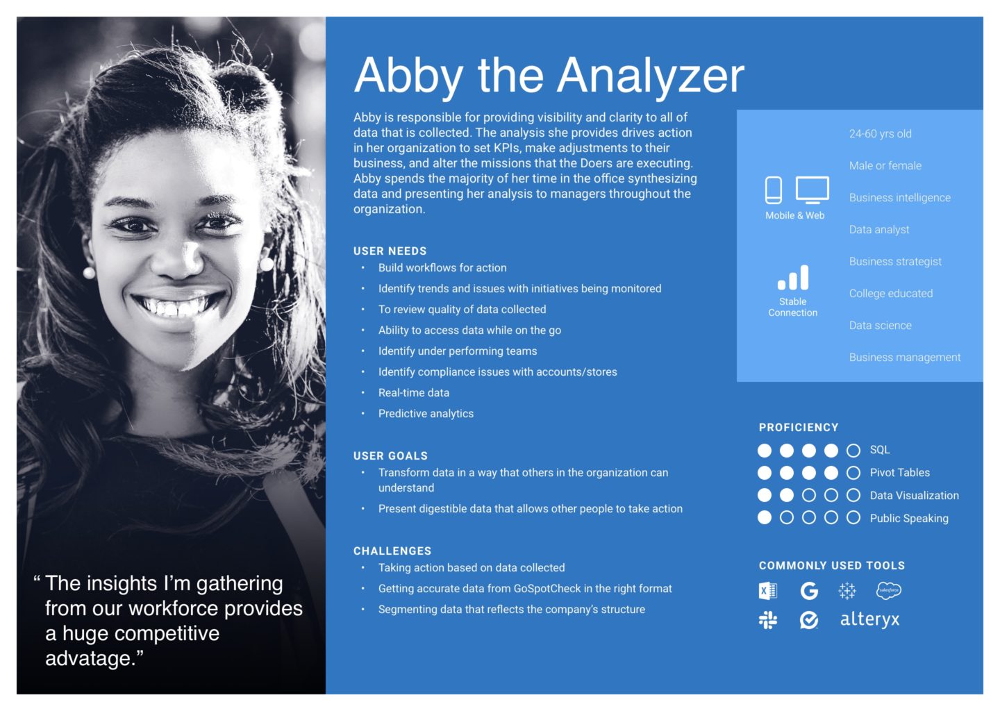
Personas
In planning and designing for this platform, we utilized a jobs-to-be-done framework to define our personas that would help us focus on what’s most important:
Oliver the Organizer
Oliver could be a data ops engineer or a savvy IT admin, but is always the person whose job it is to organize, update, and maintain the data integrity that informs his company’s workflows.
Betsy the Builder
Betsy is the person who is intimately familiar with the jobs that need to get done in order to make the business run more efficiently. She is the one who actually builds the workflows and determines when, how often, and who can complete the workflows.
Abby the Analyzer
Abby is the person who analyzes the output from completed workflows in order to provide actionable insights to the company so that they can continuously improve their operations.
Danny the Doer
Danny is the person(s) who is completing tasks within the workflow, which might include data entry, capturing a photo, or answering some questions about a task they just completed.
Discovery / Planning
For the first month on the project, I gathered all of the existing research, Aha! submissions, and NPS feedback we had on relevant feature sets we knew could help our target audience. In addition to gathering and analyzing this data, I conducted ~20 internal stakeholder interviews with:
- Customer success managers
- Product managers
- Designers
- Customer support representatives
- Sales engineers
- Engineers
- Executives
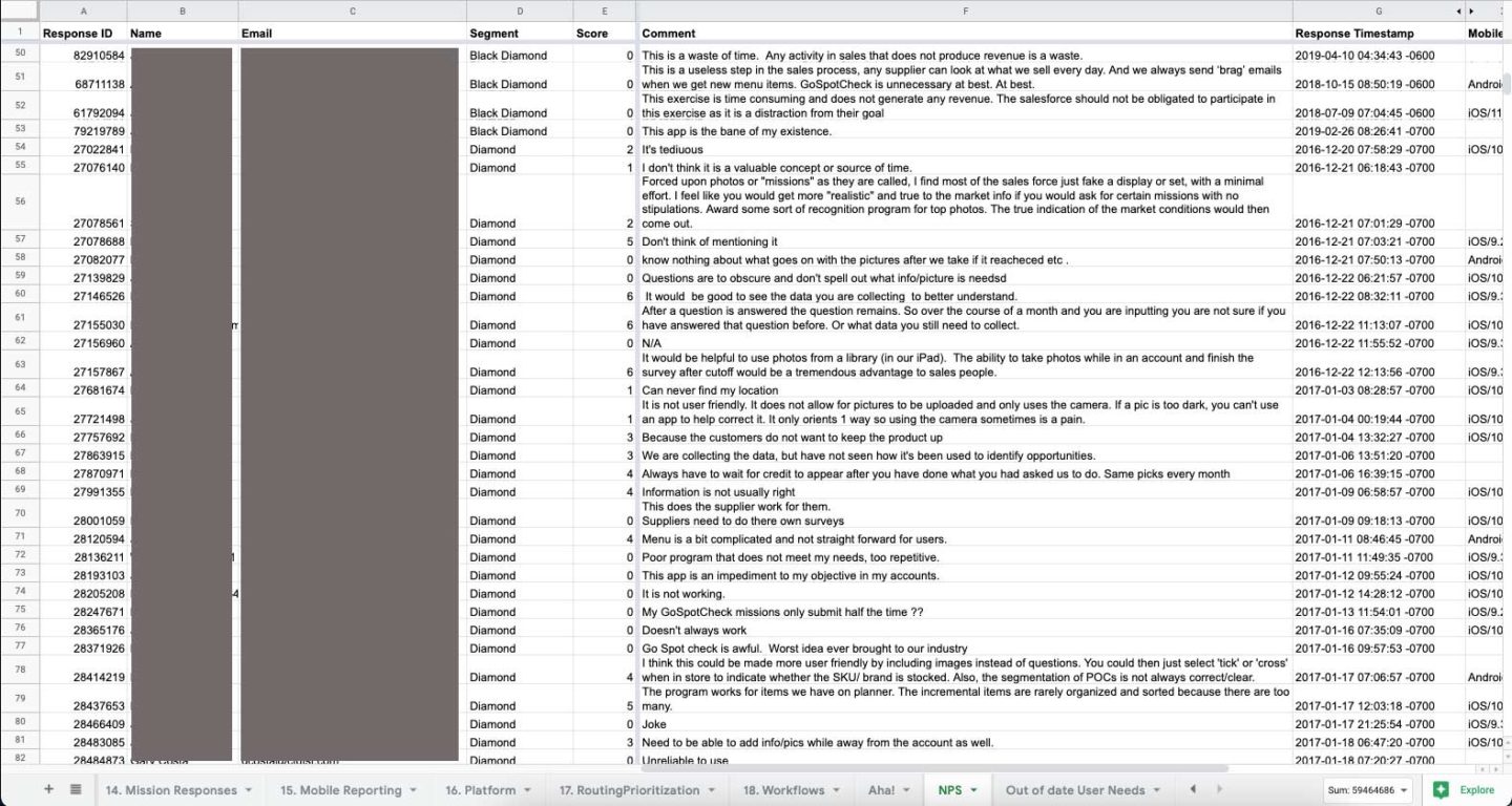
After analyzing the research, interview notes, and data I defined all of the common themes within each of the key feature sets, which helped me create a backlog in each given area. This helped frame the conversations for roadmap development with the team and internal stakeholders for the team’s areas of focus.
After identifying focus areas, we started to design customer journey maps and user flow diagrams. This helped us start to define potential information architecture options as well as the platform architecture definition.
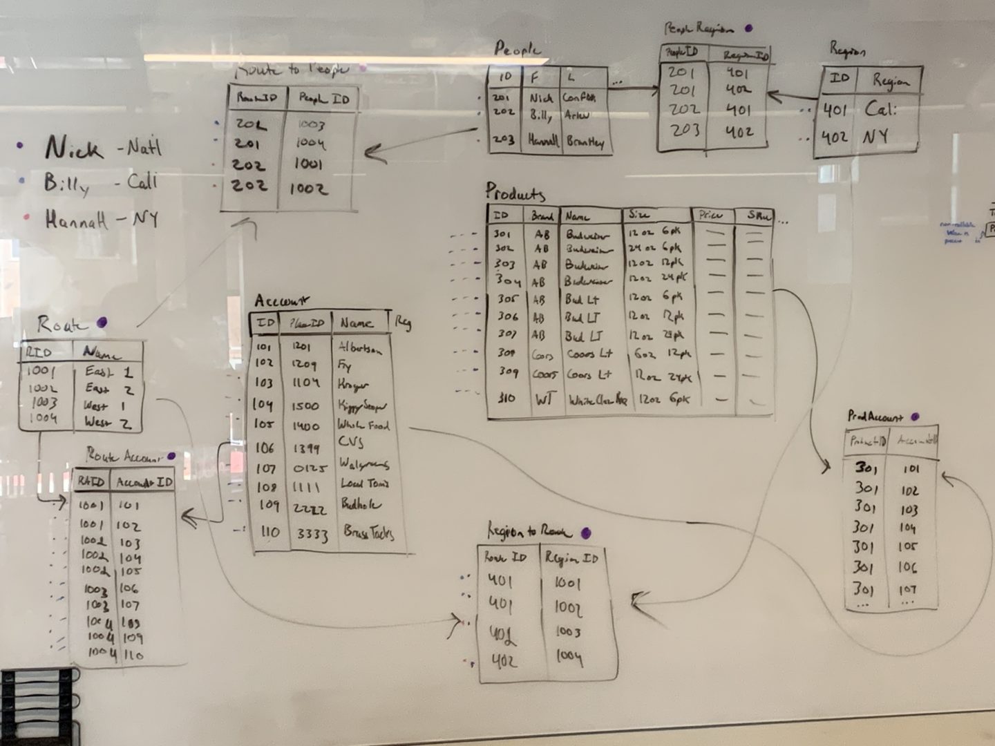
As we started to define specific functionality in areas of the platform, I often did exercises with myself to make sure we were meeting customers needs. To do this I mapped out given data schemas and drew out how I would build a workflow with the given data to solve a use case.
Design / Testing
The information architecture started to organically flesh itself out as we defined user flows and customer journey maps for various use cases. We also knew we would need to be designing for our customer as well as our internal teams to manage the tenants of the platform.
The platform architecture ended up being comprised of three applications:
- Internal admin web app
- Customer admin web app
- Customer mobile app
Internal admin web app
This app’s target audience are comprised of Project Propeller’s customer success managers and customer support representatives. Within this app, tenants could be manually provisioned/de-provisioned, users created, and account metrics monitored.
Customer admin web app
The customer’s web app is where Oliver, Betsy, and Abby would primarily work to manage data, build workflows, and analyze the output from the workflows.
Customer mobile app
The customer’s mobile app is where Danny the Doer primarily completes tasks for the workflows that are assigned to him.


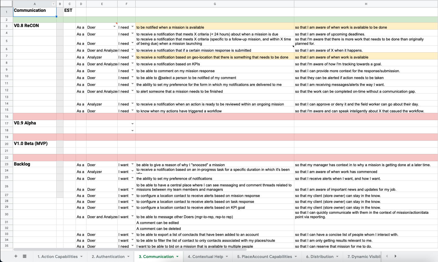
From a design perspective, I started to design key workflows for:
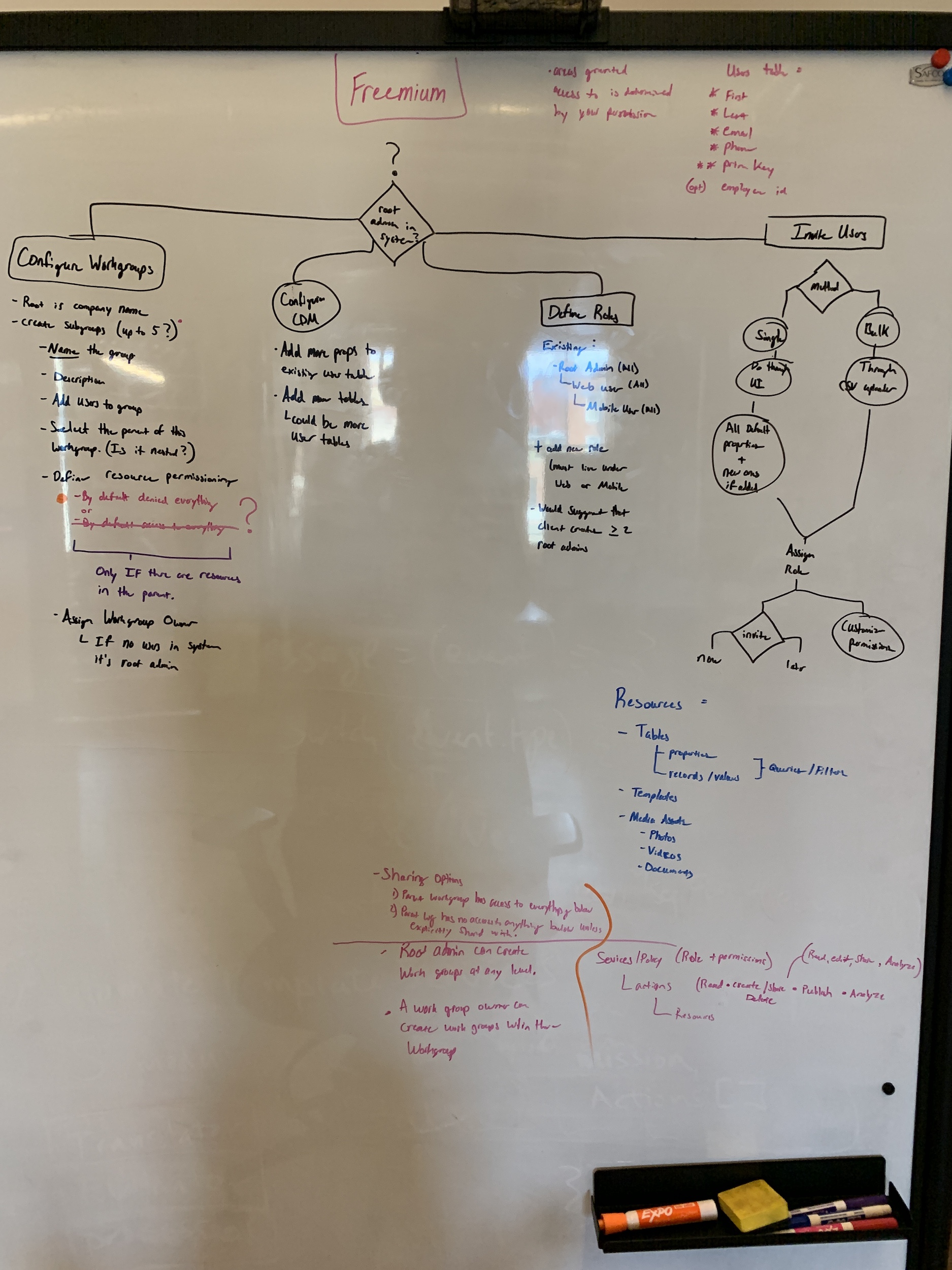
- Sign up flows for a freemium model
- Authentication flows for both web and mobile
- Key workflow building journeys (happy paths and error paths)
- Data importing and CRUD operation
- User provisioning and de-provisioning
- User role and permission assignments

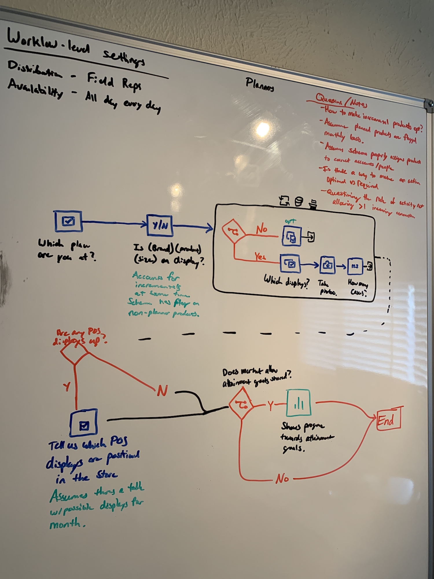
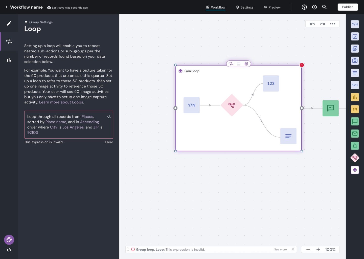
The area of the platform that garnered the most attention was the actual workflow builder itself. This was the area of the platform that we identified as high risk. At this point in the initiative, we had made the decision to develop the workflow builder with a low-code/no-code user interface. We came to this decision to maximize our total addressable market for Betsys that are both non-technical or very technical. Because of this it introduced lots of challenges that created risk for development, design, and adoption of the product.
From a product design perspective this presented many navigation and usability challenges. Within the user interface, this manifested in a builder experience that would allow the user to switch between “visual” (no code) and “advanced” (low code) mode. Because a user is able to switch between these modes at-will meant both interfaces would need to mirror the progress made in each mode in real time.

Usability studies
Because of the high amount of risk in this particular area, I ran numerous qualitative and quantitative research sessions. These sessions ranged in purpose including; testing ease of use, navigation taxonomy, overall aesthetics, and task success completion. Roughly 25 qualitative sessions and 200+ quantitative studies were conducted to analyze the effectiveness of the designs. Here is an example of a quantitative study analysis completed by me to present my findings on an area of the workflow builder.
Outcomes
After almost 18 months of developing and designing Project Propeller, GoSpotCheck was acquired and merged with Form.com. As a result of this acquisition, Project Propeller was terminated and shelved.
Bummer, right?
Protected: JumpCloud (2022)
Protected: Hat Labs (2020)
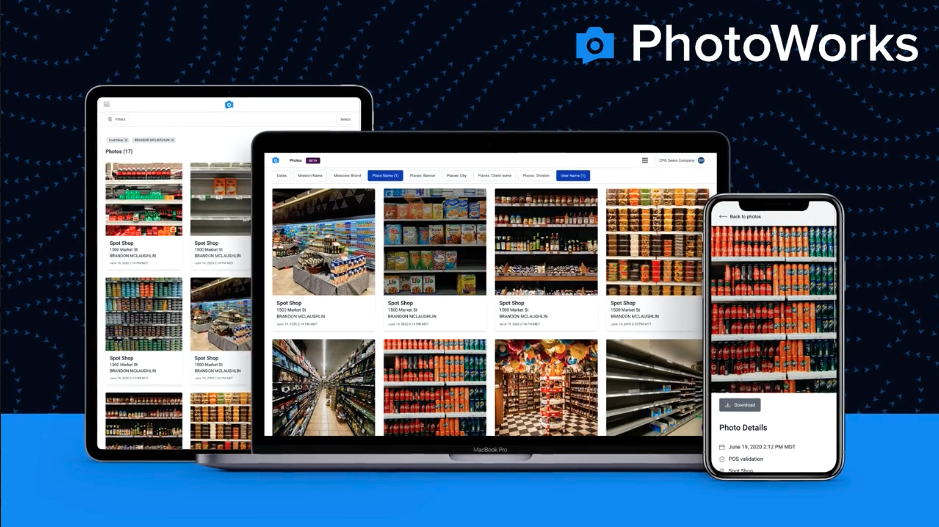
PhotoWorks (2019)
Role
Product Designer
Responsibilities
- UX/UI design
- Qualitative user testing
- Quantitative user testing
Background
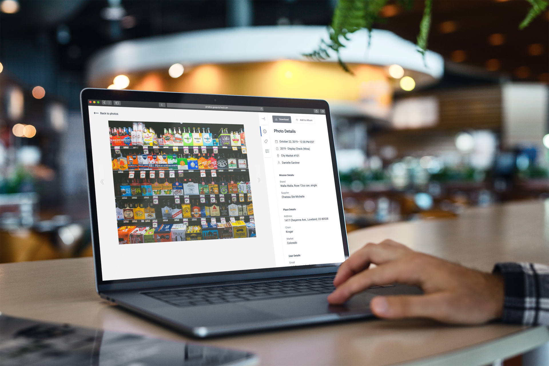
Photo tasks are the most popular task type in GoSpotCheck’s mobile auditing feature set. They account for over 40% of all tasks completed in the platform. As of late 2020, the new photo reporting product was processing over 1.5M photos per month averaging 50k/day. Clients rely on the visual confirmation of the work being done, which gives them a window into the market they serve. Even more, it provides our clients insights into their business so that they can learn and adapt their operations.
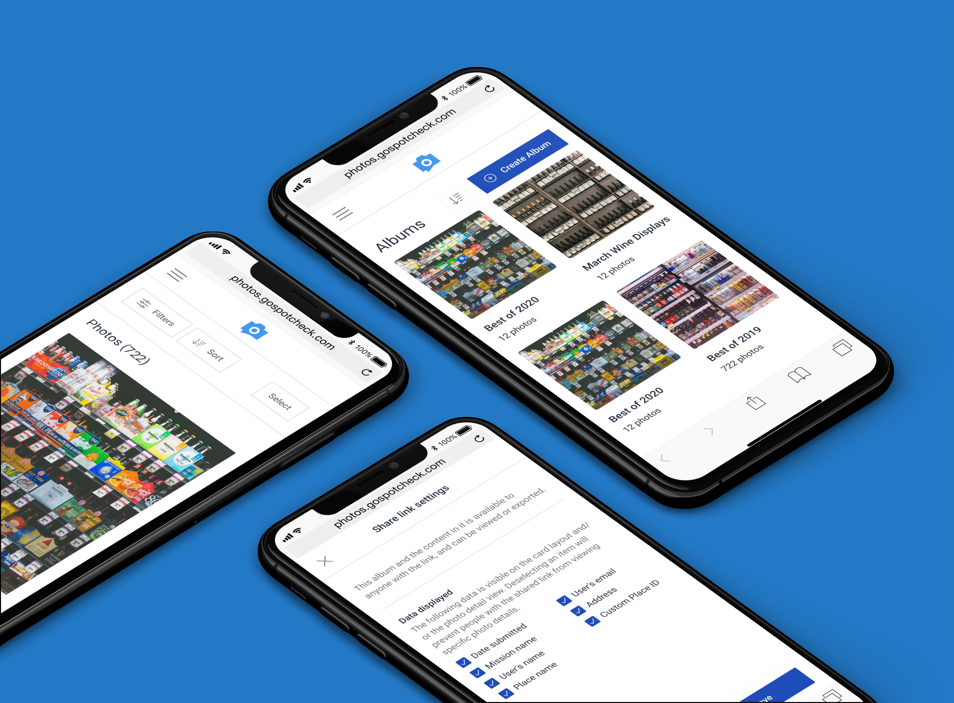
In order to report on and analyze all of the photos, Photo Album–newly re-branded as PhotoWorks–was originally designed to aggregate every photo captured in a single photo gallery where subscribers could quickly review, filter, and analyze photos. They could then consolidate and share select images with stakeholders and teams in different formats like individual JPG, PPT, or PDF file formats.
However, Photo Album had its user experience, architecture, and performance challenges. As much as it helped clients analyze photos, there were:
- Performance issues of long delays from time of capture to time of reporting
- Limited data that accompanied the photo through the data pipeline
- Searching and filtering by different dimensions was painfully slow and unreliable
- A rigid roles and permissions schema that could not be managed by users to meet their needs
Due to the high usage and revenue opportunities, we prioritized this work and approached it as a net new product with plans to sunset the old one as soon as possible. The existing Photo Album solution was one that was free to customers but a huge financial cost for maintenance, processing, and storing the captured photos. Photo Works would be a new upsell for existing clients and accounted for with new pricing packages for new clients. With a huge shift in pricing model from free to paid for this product, the stakes were high to prove to clients that it was worth paying for. We planned and roadmapped for a complete redesign and re-architecture with a beta release 9 months from when the initiative started.
Goals of the project
- Create a delightful experience for user
- Reimagine the UX to accommodate customizable data
- Create a mobile responsive experience for computers, tablets, and phones
- Cut task completion time by 50%
- Choose two filters
- Export report of chosen file type
- Given a user with ~2,000 images, average time of completion was 1:50 seconds
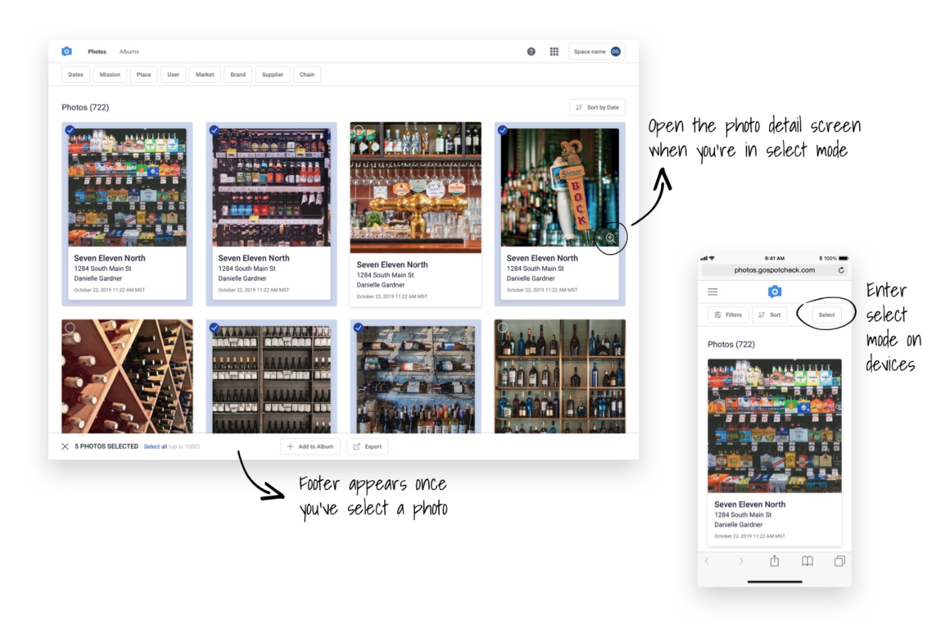
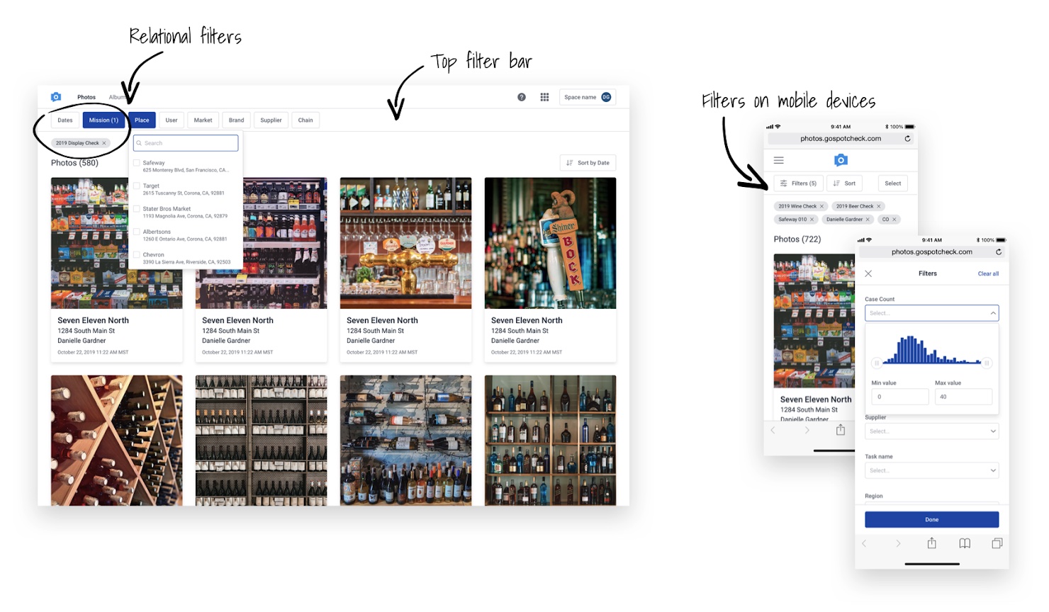
- Redesign the UI for filtering and searching while accommodating relational filters and unlimited dimensions to filter by
- Account for different permutations due to a new roles and permissions schema
- Create a new UX for creating and sharing photo albums (a new concept in this product)
Design and user testing
As part of the redesign, we analyzed product usage metrics via Pendo and had insights into user patterns and feature usage in the existing product. In addition to knowing common usage patterns, the product manager collected feedback from internal and external stakeholders and organized a backlog for the necessary feature sets.
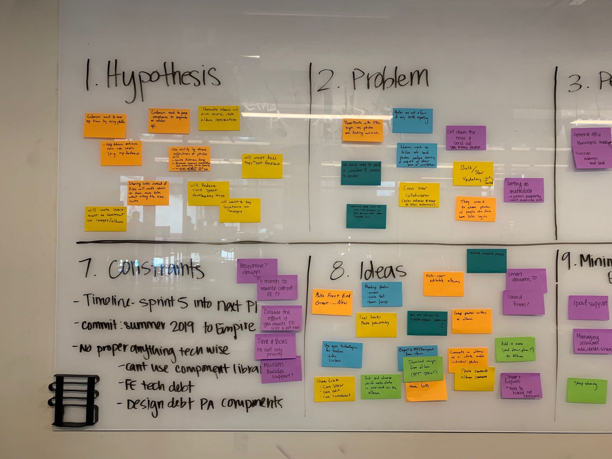
Starting with a product inception meeting, we discussed:
- Hypothesis to test
- Problems to solve
- Personas
- Stakeholders to keep informed
- Core team
- Values we needed to deliver
- Constraints
- Additional ideas
- Minimum viable experience
- Target metrics of the new solution
After the inception, the designers moved on to working on card sorting exercises for a new information architecture, and mocking up wireframes for proposed layouts.
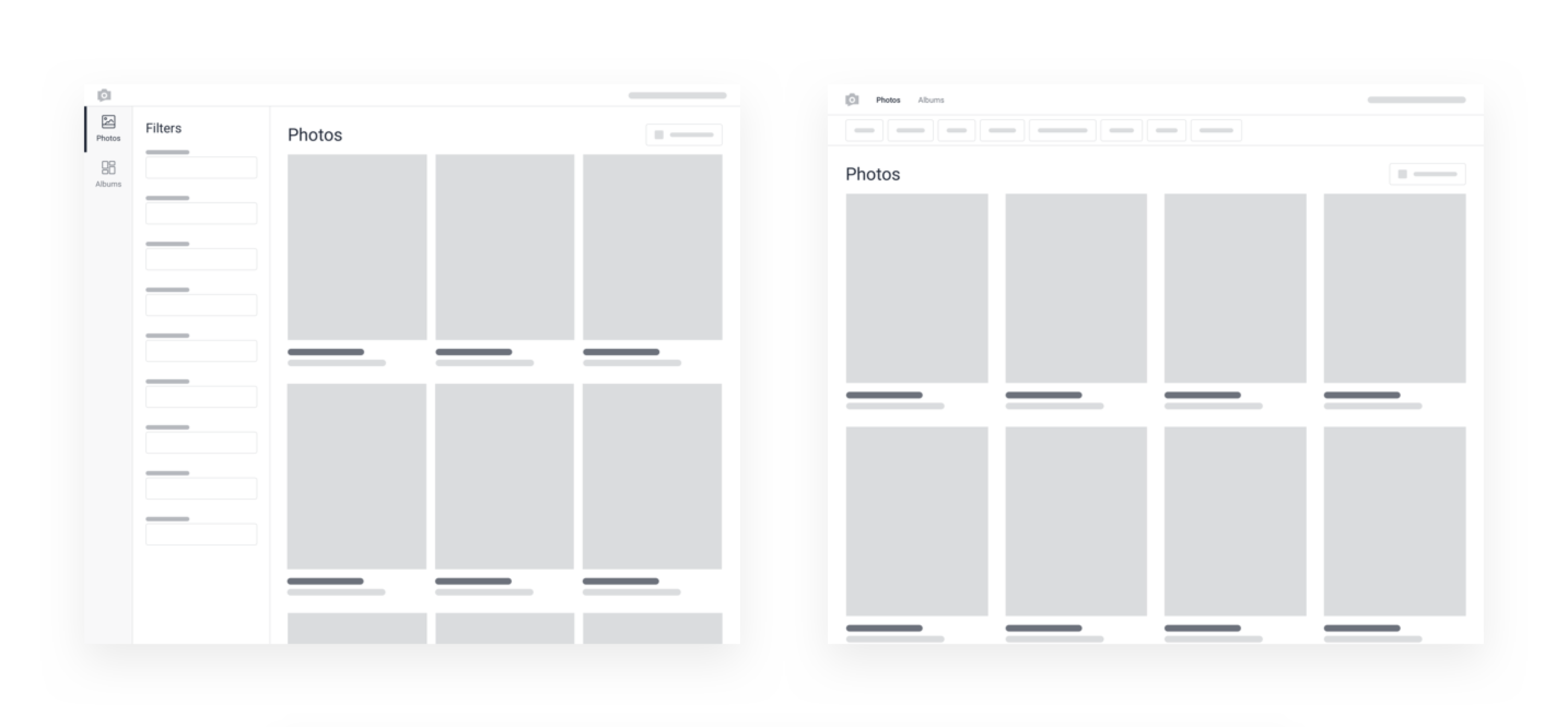
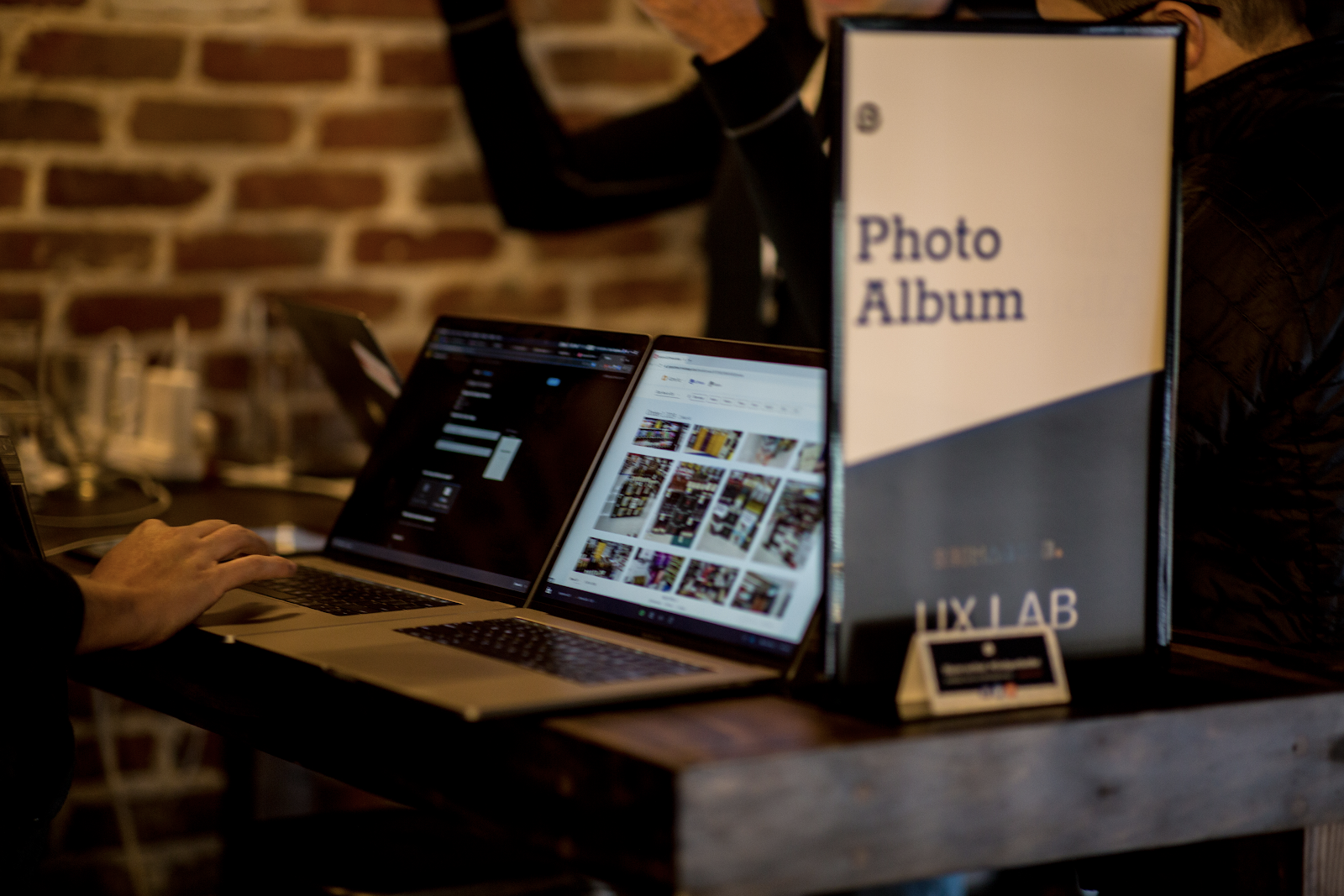
Once general layouts for all key pages were established via wireframes, I created a high-fidelity, interactive prototype for the major functionality of the application. With this interactive prototype, we prepared both qualitative and quantitative testing to be executed at our company’s annual customer conference, Reimagine. At the 2-day Reimagine conference we hosted hundreds of customers and put on keynote presentations, had different attendee tracks, and multiple interactive experiences. One of which was a UX Lab where people could come and test out new feature sets and product offerings. For two days my product manager and I ran 1:1 usability testing sessions where we learned the likes and dislikes of the application along with collecting feature requests and suggestions for improvements.
In addition to the qualitative sessions, we had a post-conference survey to gain more feedback for anyone who participated in our usability testing sessions. In total, my PM and I hosted ~40 1:1 sessions with customers, and nearly all of them requested BETA access for our launch.
Absolutely loved the new photo album.
With the feedback we gathered from the customer conference, we confirmed that we had the right feature set, and it helped us prioritize the features we needed for an MVP from an engineering and design aspect. The sessions helped us validate:
- UX patterns for maximizing the real estate between filters and scrolling for photos
- The needs around sharing and the different formats needed
- The configurations needed to improve exporting of documents (PDFs and PPTs)
Results
As a result of a successful UX lab and word traveling amongst customers organically of the new product, we had a list of 80+ customers who volunteered to be apart of our beta product before our general audience release.
After a successful launch of the product with a conservative time period for customers to opt-in, we had the majority of our few hundred clients migrated to the new platform with minimal friction. We were also able to upsell existing clients on to the new product who weren’t previously using photo reporting at all. PhotoWorks ended up being a key piece in the 2020 acquisition of GoSpotCheck who’s majority assets were acquired (including PhotoWorks) in a divestiture by FORM.com. Having a photo reporting tool as powerful and simple as PhotoWorks was something that complemented FORM.com’s product offering to their clients.
In the end we achieved our goals we set out to accomplish
- New, engaging user experience designed to give speed, accuracy, and control working with photos
- ~65% faster task completion from time to search, find, and export reports
- Average time to completion was down from 1:50 min to ~40 seconds
- Near real-time syncing of photos that populate as soon as the workflow was submitted and processed
- Powerful, customizable, new filters that enabled faster search capabilities on any dimension
- Enabled the product to be mobile responsive for ease of reporting on any device
- Improved roles and permissions structure, along with a “spaces” architecture to create work groups, so that customers could customize segments of user access
- New ways to share photos and albums via shareable, private URLs
- Better exporting and report building with more control over sizing, quality, formatting, and data point selectivity
Additional reading on this product
- PhotoWorks launch article
- Article focused on design and rationale (from the POV of the other designer on project)