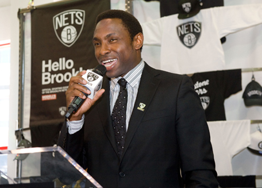
Just released this week, the newest team in the NBA has released their new identity. The former New Jersey Nets, now the Brooklyn Nets, are crossing the Lincoln Highway to their new home in Brooklyn, the Barclays Center.
Their new identity… Designed by JAY-Z. Say what?!?!?!
That was my first reaction when I read the headlines. But I actually like the new identity. I think it fits well with the attitude the New York borough exudes.
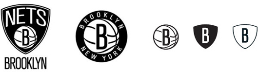
The new primary logo – created by Brooklyn’s own JAY Z – retains the shield from its previous iteration, and adds that iconic Brooklyn ‘B’ to the basketball that has been part of every logo since the franchise’s 1967 inception as the Americans. The Dodgers had their lettermark, and the Nets have added another model for the borough to bear. “Brooklyn,” of course, is spelled out below. Nets CEO Brett Yormark called this “the new badge for Brooklyn,” and JAY Z believes the design’s boldness demonstrates confidence in the new direction.
The secondary logo, of the ‘B’ inside a basketball, surrounded by the words “Brooklyn New York” immediately popped an image into my head: “Planet Brooklyn.” It’s hard to explain the pride native Brooklynites feel for their home (“BK,” “Bucktown,” the “Brooklyn Zoo”), how outsiders don’t get it and never really will; one measure might be trying to think if you’ve ever met someone from Brooklyn who said they were from “New York.” Another could be the lines I once wrote in a spoken word poem:
I like to sport attitudes like
I’m better than you
because I’m from Brooklyn
… and that’s just how we do.Ben Couch, NBA.com
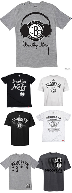
As back seat graphic designer, I am questioning his reasoning for the type choices and his restricted use of JUST black and white. Overall, I do like the variety of t-shirt designs and other Nets’ swag. I wonder if Jay-Z had a “ghost graphic designer?” Did Beyoncé help him out? Hmmm….