A great example of why a company’s logo MUST be simple. The more simple it is, the more memorable it is.
Archives for January 2012
Rebrand: DC Comics
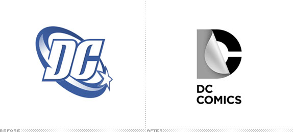
I love this redesign. The concept behind the “DC” wordmark is spot-on. You be the judge. Below is an article from DC Comics website by blogger Brandy Phillips on the redesign.
Honest Logos by Viktor Hertz
This is an awesome set of Flickr photos by Viktor Hertz …
An idea for a series with honest logos, revealing the actual content of the company, what they really should be called. Some are cheap, some might be a bit funny, some will maybe be brilliant. I don’t know.